I built Ogloba Brand Center as a shared download portal for company logos, brand artwork and visual resources. Colleagues, customers and production vendors can find the right files and their usage guidance in one place. I also designed the public Partner ID lookup experience. As UIUX Lead, I connected the information architecture, asset choices and interaction details, using ReactJS, Next.js and AI assistance to turn those decisions into a working site.
The repository records the v0.4.0 release on July 31, 2026, with further refinements committed on August 19. Those are project milestones, not this article's publication date or a claim that all work was finished. The links below open the public Brand Center and verification page. Here I focus on my UIUX decisions, the problems I encountered and how I worked through them.
A brand library should help someone finish a task
The audience is not only designers. Business colleagues, customers, partners and production vendors also need to download company imagery, choose a format and understand the rules. A folder of exports leaves them to guess which file is current and whether it fits their use case.
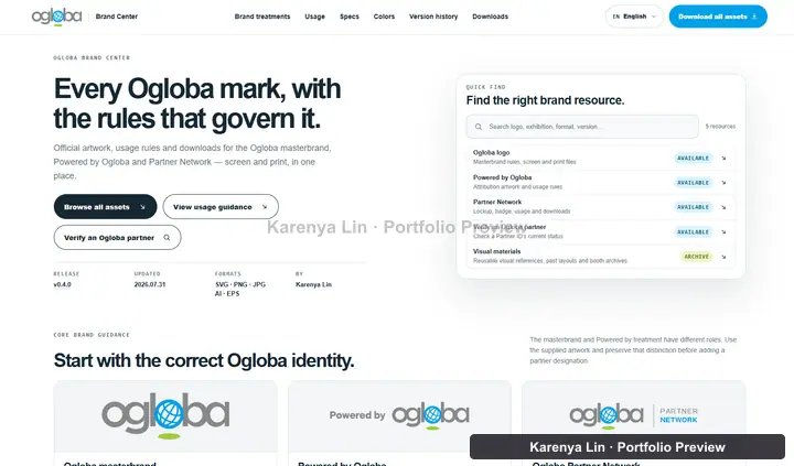
I organized the experience around those decisions. The library answers what to download. The usage guides explain how to apply it. I also designed a public Partner ID and lookup experience so visitors can identify a partner through the verification page, rather than treating a downloaded logo as the answer.
Keeping these purposes distinct mattered. A downloadable Partner Network mark describes a program. Having a copy of that artwork is not the same thing as having an individual verification record.
My role and the tools I used
I defined the page priorities, reviewed the brand treatments, chose between interaction proposals and followed the details through implementation. AI assisted with code, export scripts and checks. I still had to decide what belonged in the product, what was misleading and which tradeoffs were acceptable.
This project uses ReactJS through Next.js, with TypeScript and CSS Modules. It is not the same stack as the separate Ogloba corporate website prototype. I did not need to add a large UI library just to build an asset finder and a verification form.
- Figma and the supplied vector artwork provide the design and brand references. The original Ogloba wordmark is preserved instead of being retyped or redrawn.
- Next.js App Router handles pages and locale routes. React handles filtering, preview choices and lookup states. TypeScript describes the asset and partner records.
- CSS Modules and shared tokens keep spacing, color, focus and motion consistent across the library, guides and verification page.
- Sharp and project scripts prepare image outputs and asset packages. ESLint, TypeScript and dedicated checks cover SEO, accessibility rules, color-space handling and localized copy.
- GitHub stores the versioned project. Vercel provides the deployed site and a place to review changes in a browser.
The delivery workflow is GitHub to Vercel
I keep the design decisions with the project so the next change has context. A request such as making the finder easier to scan becomes a specific change to grouping, card content or navigation, rather than an instruction to make everything look cleaner.
The workflow for this site is GitHub to Vercel. I work on the Next.js project locally, review the result, run the relevant checks and publish the approved changes through the repository. The documented branch policy uses short-lived branches and preview review before changes reach main, the production branch.
The release information connects the version, date, owner and deployed commit. This matters when a preview, local checkout and production page do not show the same thing. I check which revision I am looking at instead of assuming that the latest local main is already deployed.
Brand changes also affect the downloadable files. Updating the preview alone is not a release. The active package, its contents and the visible usage guide need to describe the same version.
I changed the library from file browsing to design browsing
The early structure gave Partner Network too much of the site's identity. I expanded the library around three distinct treatments: the Ogloba masterbrand, Powered by Ogloba and Partner Network. Someone looking for the main logo should not need to understand the partner program first.
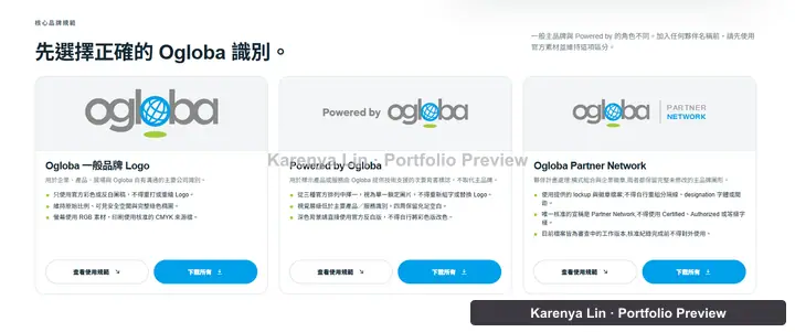
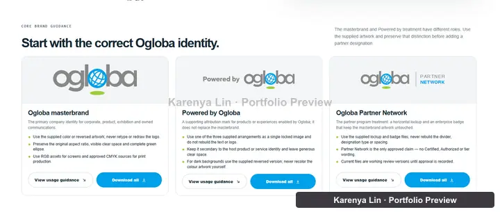
I made category browsing the first step and search a supporting tool. Version history moved to its own route, while detailed production rules stayed with the design-system and usage guidance. This stopped the finder from carrying every kind of information at once.
Another iteration had separate cards for color, single-ink and reversed artwork. That made the library look like it contained many different designs when several cards were only variants. I changed it to one card per design, with the relevant previews and formats grouped together.
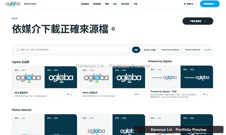
I also removed links to resources that were not actually available. A Figma or download label is a promise. If there is no usable destination, it should not look like a finished action.
Brand consistency includes geometry, not just color
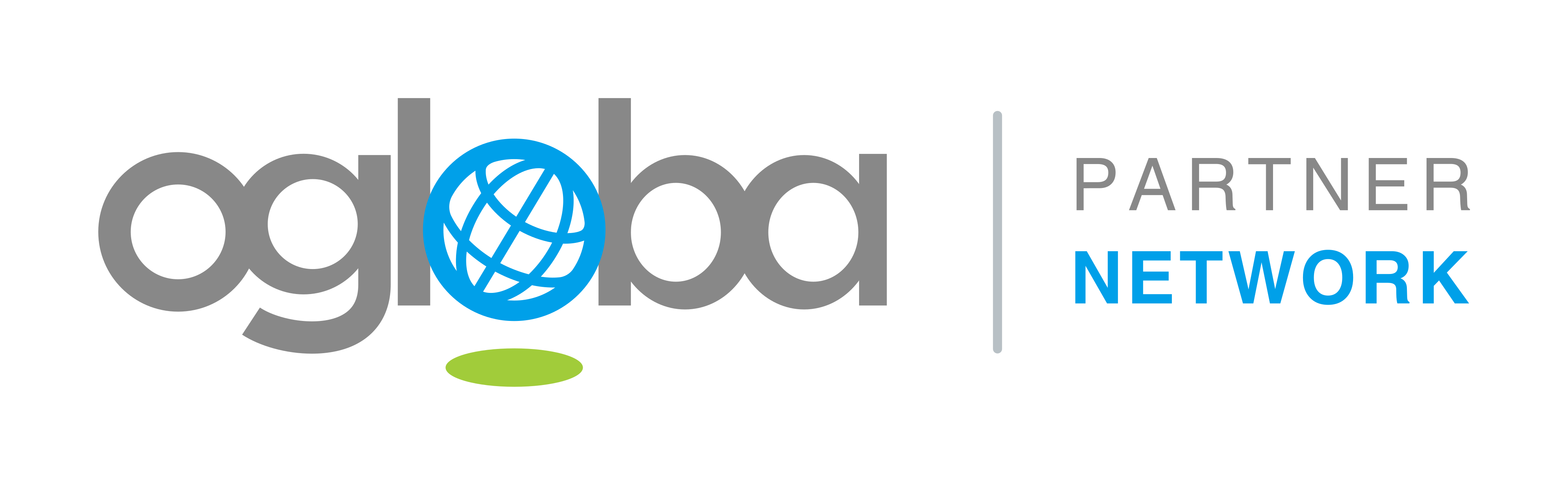
For the horizontal Partner Network lockup, I kept the official Ogloba artwork and a visible divider. The designation needs to read as a program associated with the brand, not as a replacement for the brand itself.
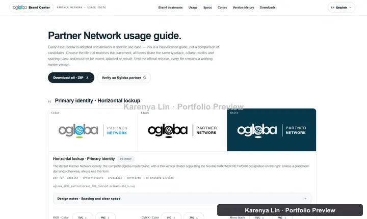
Alignment needed more care than centering two exported rectangles. The logo has a descender and a green ellipse, so its full file bounds are not the same as the visible body of the wordmark. I reviewed the relationship using the visible artwork and kept the geometry consistent across color and reversed versions.
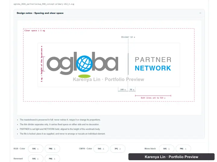
One concrete mistake appeared during iteration: the library and guide had moved to the adopted divider, while the landing page still used an older export. I corrected the landing-page reference and the related specifications. A design can be consistent in Figma and still be inconsistent across the actual files a site serves.
Put usage guidance beside the asset choice
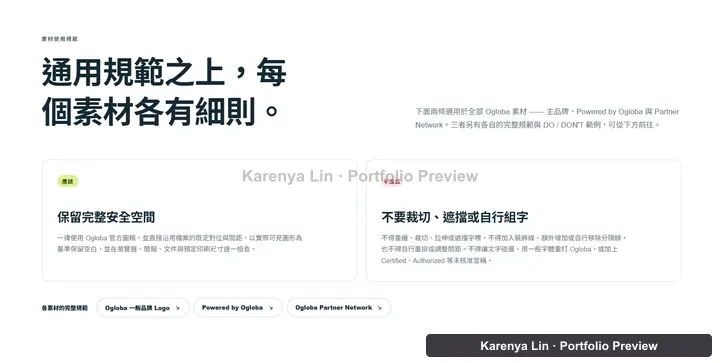
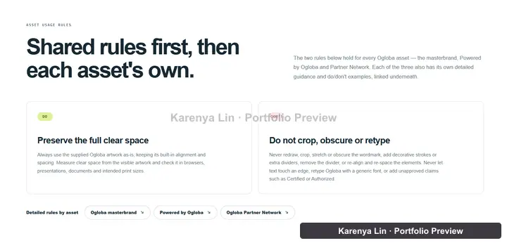
I separate shared rules from asset-specific guidance. The overview explains clear space and preserving the supplied artwork, then links to the relevant guide. Someone choosing a file can follow the next step without reading every production detail first.
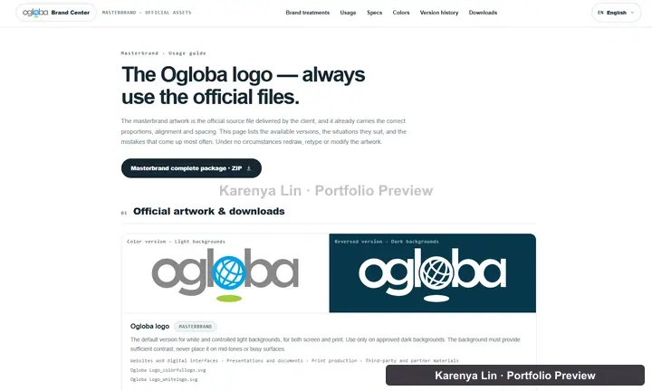
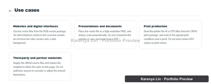
The masterbrand guide connects official files to practical situations: websites, presentations, print and third-party materials. Showing a color or reversed preview alone is not enough. The person downloading it also needs to know which source fits the medium.
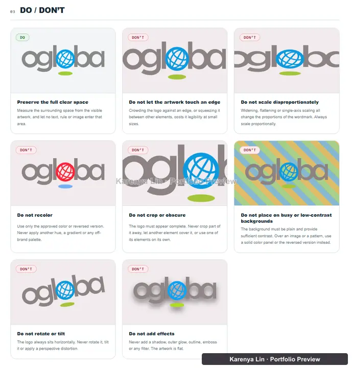
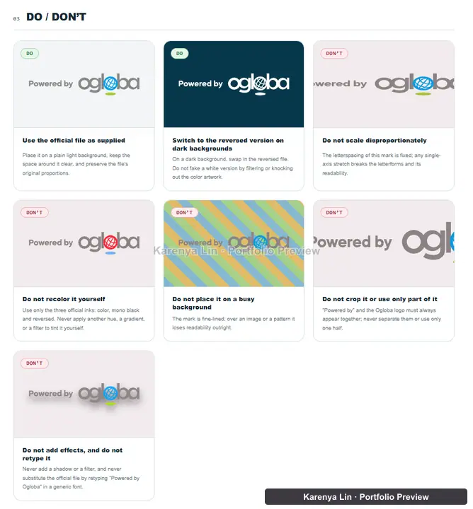
Visual do and do not examples make the constraints concrete. Cropping, stretching, recoloring and low-contrast backgrounds are easier to recognize in a comparison than in a long paragraph. The illustrations explain the rule without asking a non-designer to interpret a specification from scratch.
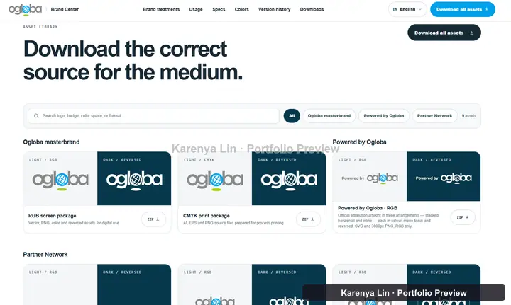
A download button has to deliver the right files
I changed Download all so it downloaded the active asset pack instead of sending the reader to another section. The pack should not mix current artwork with archived explorations just because those files still exist in the project.
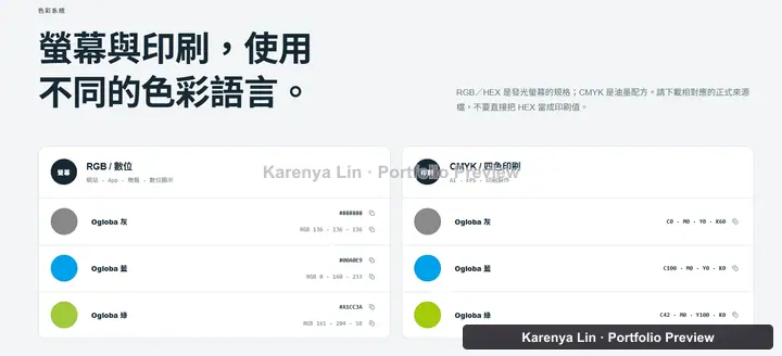
Screen and print outputs also need different labels. RGB previews help someone choose artwork on a screen. They do not replace the supplied CMYK production files or an agreed print proof. I kept those uses separate and did not invent a Pantone value when none had been supplied.
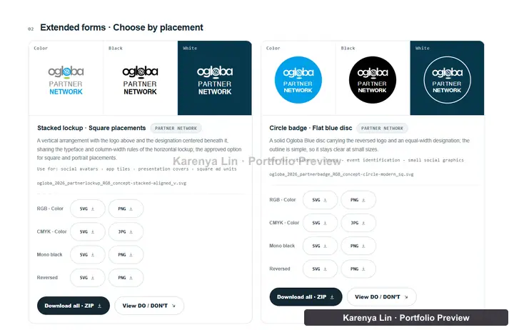
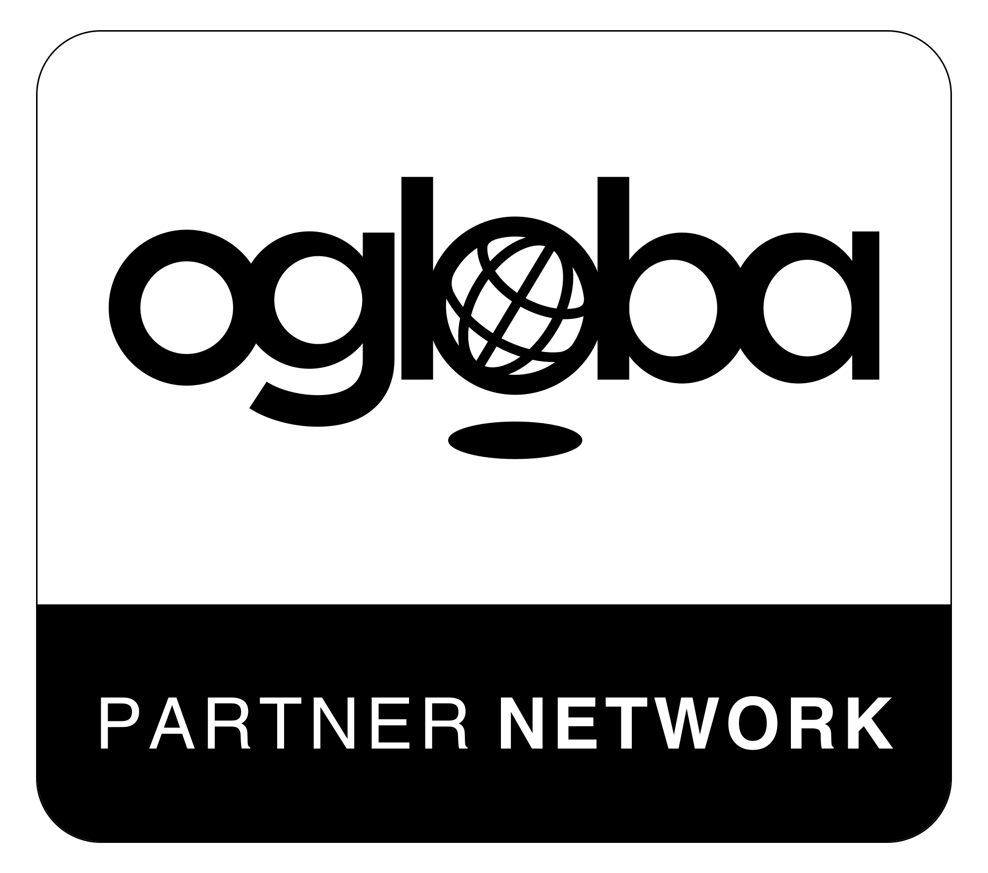
The two badge images below show why grouping matters. Color and single-ink are two versions of the same design. The user should choose a treatment once, then get the formats appropriate for its use.

Choose a supplied variant for the space available
Powered by Ogloba needs to remain a technology attribution, not compete with the main product identity. The guide presents a stacked arrangement for square and narrow placements, with the text and logo kept together as supplied artwork.
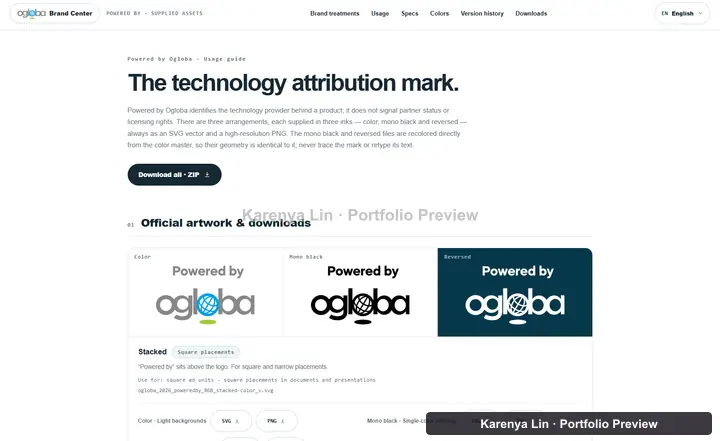
The horizontal arrangement fits wider positions such as footers and banners. I keep its use case beside the preview and downloads, so the choice is about the placement rather than which layout looks nicest in isolation.
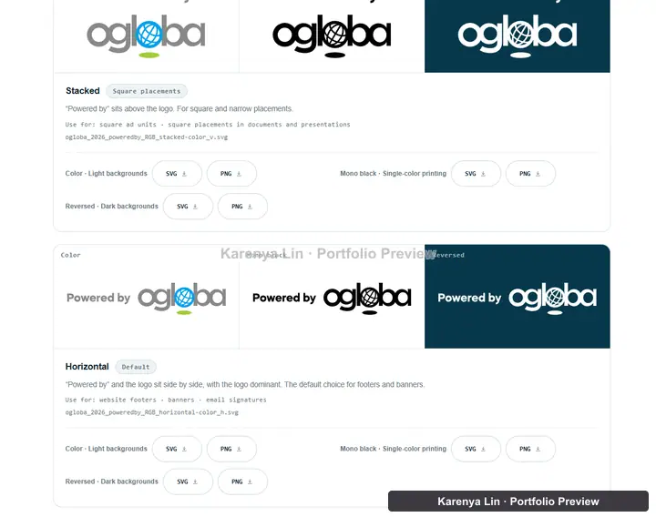
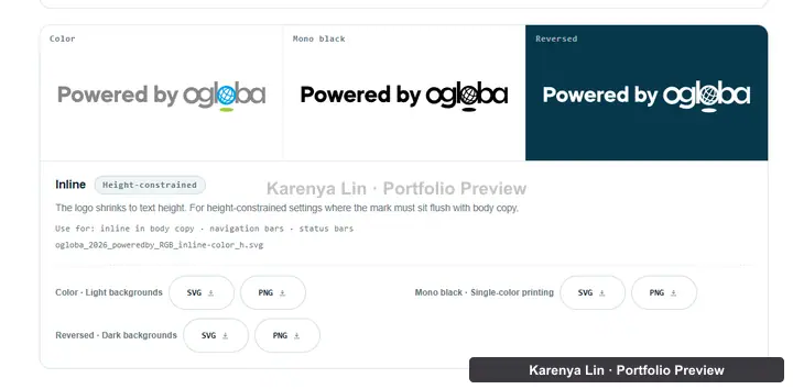
A height-constrained placement needs an inline variant. It is not a reason to stretch or flatten another file. Explaining that distinction helps preserve the design after someone takes the asset out of the Brand Center.
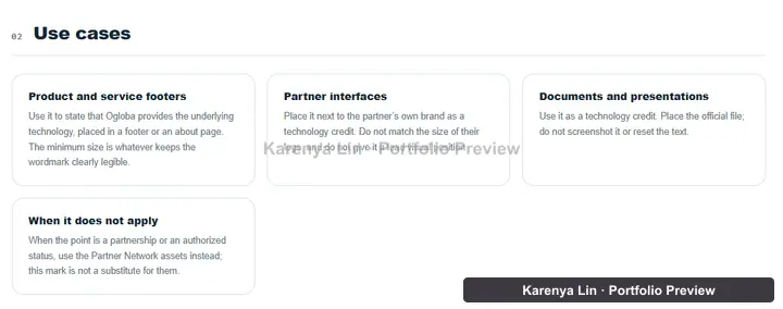
The guide also explains when this mark does not apply. Technology attribution and a partner designation are different communication tasks. The interface should help someone choose between them without implying that a generic image is an individual verification result.
I use the same visual comparison pattern for this family too. Correct color and reversed versions sit beside examples of stretching, recoloring, cropping and busy backgrounds. The rule is reinforced where someone is making the file choice.
Lookup and browsing should lead to the same answer
For verification, I wanted both a precise Partner ID lookup and a browsable partner directory. They serve different starting points, so I kept both instead of replacing one with the other.
A three-column proposal gave the lookup, directory and page QR similar visual weight. The QR was a secondary utility, but it occupied a whole column. I changed the layout to an asymmetric two-column structure, with lookup and result as the primary area and the directory as the supporting area.
I then asked for clicking a directory entry and entering an ID to open the same detailed card. Two separate result experiences would make people wonder whether they were seeing different information. I kept the presentation consistent across those two starting points.
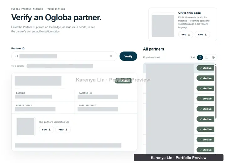
The first combined version also had two search fields. I removed the directory search and kept one Partner ID input, with sorting for the browsable list. A page-level QR and a partner-specific QR remain different: one opens the page, while the other opens a particular result.
An empty state must not look like a verified result
Before a lookup, the primary column looked empty beside the directory. Filling it with a preselected example card would have balanced the layout, but it would also have put a record in the answer position before the reader asked a question.
I used reference material instead: how to read a Partner ID and what the status labels mean. Once a lookup runs, the result replaces that guidance. The page does not show an example and an actual answer side by side.
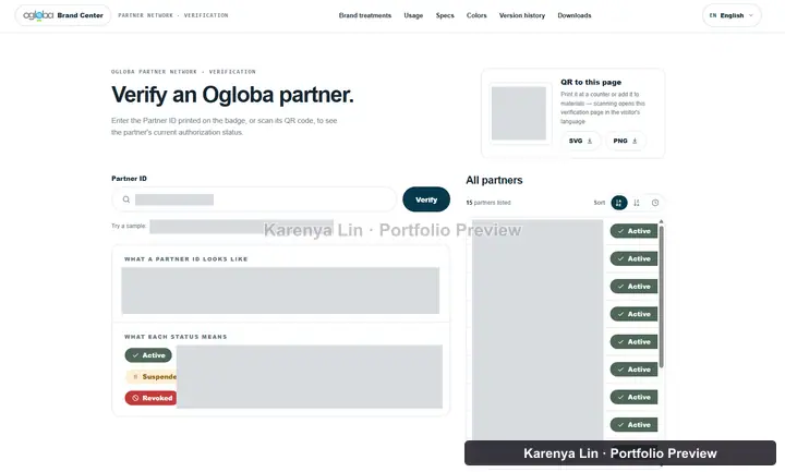
I also separated an invalid ID format, an ID that was not found and a partner whose status is revoked. A typo is not a reason to accuse someone of using a fake badge. Format and no-result messages use neutral guidance, while a genuinely revoked record has a distinct status treatment.
The downloadable badge artwork has no individual Partner ID on it. That ruled out another tempting illustration showing readers where to find an ID on that generic badge. Helpful guidance still has to describe something that actually exists.
The mobile bug was a missing answer, not a broken grid
A directory selection updated the result correctly, but on a narrow screen the result sat above the list and outside the viewport. The interface had changed, yet the person who clicked could not see the answer. Checking only whether the columns stacked would have missed it.
I treated feedback according to the entry point. Selecting a directory row brings the result into view and moves focus to it. Submitting the ID form keeps focus near the input and announces a short result summary. Arriving through a shared ID link does not immediately take focus away from the page.
The selected row has a visible selected treatment and an accessible current-state marker. Status uses a label and icon as well as color. I also kept focus indicators visible inside scrollable areas and respected reduced-motion preferences for scrolling and transitions.
This is where accessibility and UI testing meet for me. The question is not only whether a click changes the data. It is whether someone using touch, a keyboard or assistive technology can understand what just happened.
Localization includes labels that are easy to miss
The Brand Center supports English, Traditional Chinese, Simplified Chinese, French, Spanish, Indonesian and Arabic. I treated translated guidance separately from the official brand artwork. The artwork and Partner Network designation inside a downloadable mark are not translated or mirrored.
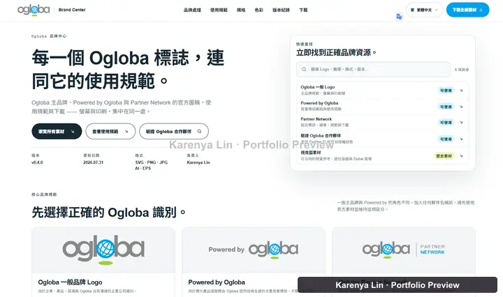
Arabic changes the page direction. Technical values such as IDs, filenames and color codes still need a readable left-to-right order, but that does not justify forcing an entire translated label or paragraph into left-to-right layout.
One review found text that visual reading alone had missed: sort-button names, tooltips, image descriptions and clear-field announcements. Those strings moved into the locale content too. The project checks were expanded to inspect attribute text rather than only visible paragraphs.
SEO had a similarly concrete correction. Subpages had inherited a homepage canonical URL. I changed the requirement to a canonical for each actual page, with the corresponding language alternatives. Localized titles, descriptions and the share image also belong to the page being shared, not just the site as a whole.
Keep shared artwork separate from an individual result
A reusable brand mark and an individual lookup result do not communicate the same thing. If they look interchangeable, someone could mistake a downloaded image for a current result. I kept those two kinds of content separate in the interface.
The shared artwork carries the brand treatment. Information that changes with a lookup belongs in the result area. I reviewed the library, guidance and result presentation together so they did not make conflicting visual promises.
My contribution was to make that distinction understandable through layout, labels and artwork. This case study describes those design choices, not individual partner records or the business rules behind them.
What I take into the next project
This project brought together design-system work, asset delivery, information architecture, search and selection, responsive behavior and release management. My main contribution was connecting those parts so a visual decision did not stop at the mockup.
I keep the decisions that changed the product, including the proposals I rejected and the mistakes found during review. One card per design, one shared verification result and a deliberate idle state are much more useful to the next person than a note saying the UI was polished.
Next, I want to track how often people need help choosing an asset, whether they download the right format and whether they can find the result after an interaction. Those observations would help me decide what to improve after the interface itself is working.