From sitemap to production: my AI assisted website workflow
I use a working website to test what a finished design cannot answer on its own. The Ogloba website prototype is where sitemap, Figma, AI instructions, React components, motion, languages and quality checks come together.
This is my work on an in progress corporate website prototype, not a claim that the final website or WordPress implementation has shipped. Company names, client logos and figures inside the screenshots belong to the prototype content. They are not my personal performance metrics.
Explore the live website prototype (new tab)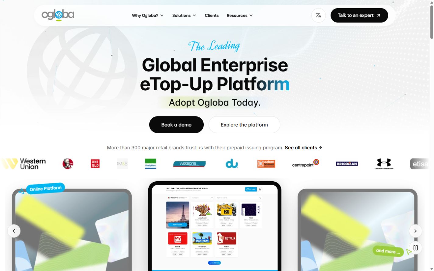

The workflow starts before code
A completed Figma screen still leaves questions open. What happens between desktop and mobile? Can a long French headline fit? Does a moving background help the message or delay it? I built this workflow so those decisions could be tested before committing to the final platform.
- SitemapI define the relationship between solutions, resources, company information and contact routes. Repeated page types become candidates for shared templates.
- Completed Figma designI establish hierarchy, visual tokens, component states and desktop/mobile intent. Figma gives implementation a target, rather than asking AI to invent the design.
- AI workflow and project skillsI define which files to read, how to reuse components, what not to change, and what counts as a verified result. A focused page brief adds the local content and interaction requirements.
- Next.js prototypeI turn the design into a browser experience with actual content, navigation and motion. This is a validation environment, not an automatic production certificate.
- Continuous reviewI compare design and implementation, resize between breakpoints, test languages and interaction states, and feed repeated findings back into the component or project rule.
How I set up the React layer
React is the UI library. Next.js is the framework around it, providing routing, rendering and metadata conventions. The prototype manifest uses Next.js 15 with React 19 and TypeScript. That describes this project, not a recommendation to install an old framework release.
For a small comparable project, I would start with the current Next.js scaffold and add only the libraries needed by the interface. This example creates a starting point, not a copy of the company repository.
npx create-next-app@latest workflow-demo --ts --eslint --tailwind --app --src-dir --use-npm
cd workflow-demo
npm install next-intl framer-motion embla-carousel-react @radix-ui/react-accordion
npm install --save-dev @playwright/test vitest
npm run dev
Installing packages is only the first step. Locale routing, message loading, tokens and test scripts still need configuration. I follow the framework and library documentation for the installed versions and commit the lockfile.
Next.js setup documentation, next-intl routing documentation
- Next.js + TypeScript
- Page routes, metadata and typed component contracts keep the implementation inspectable.
- Tailwind CSS
- Shared spacing, typography and color rules keep repeated sections consistent.
- next-intl
- Locale routing and separate message files keep translation out of page markup.
- Framer Motion
- Timing, transforms and reduced motion handling support the image based depth and rotating headline.
- Embla Carousel
- A carousel foundation supports responsive slides, with explicit navigation and pause behavior added around it.
- Radix primitives
- Accordion and navigation primitives provide an interaction foundation. Labels, focus and visual review remain my responsibility.
- Vitest + Playwright
- Unit contracts and browser regression checks cover different risks. Neither replaces visual judgment.
Components follow content responsibilities
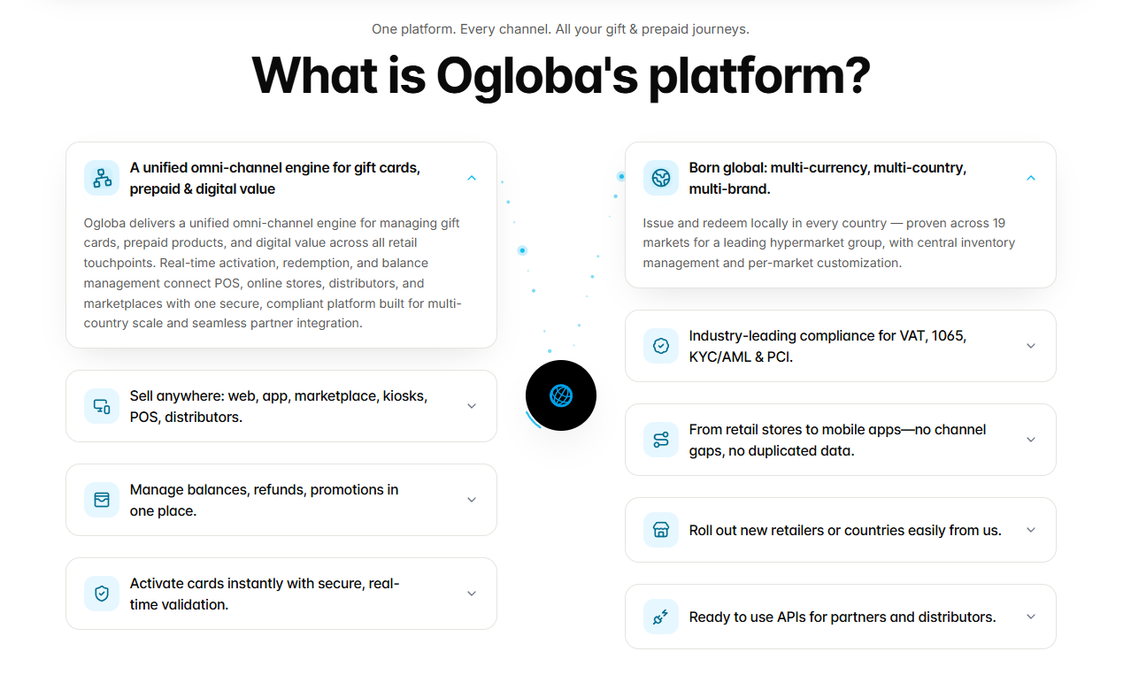
The homepage is composed from named sections such as Hero, LogoCloud, HeroImage, WhyChoose, ReelsSection, FAQ and FinalCTA. The benefit is not the number of files. Each section has a clear content, state and responsive responsibility. A lower level Button or motion helper can then be reused without copying an entire page.
<PageShell>
  <Hero />
  <LogoCloud />
  <HeroImage />
  <WhyChoose />
  <ReelsSection />
  <FAQ />
  <FinalCTA />
</PageShell>
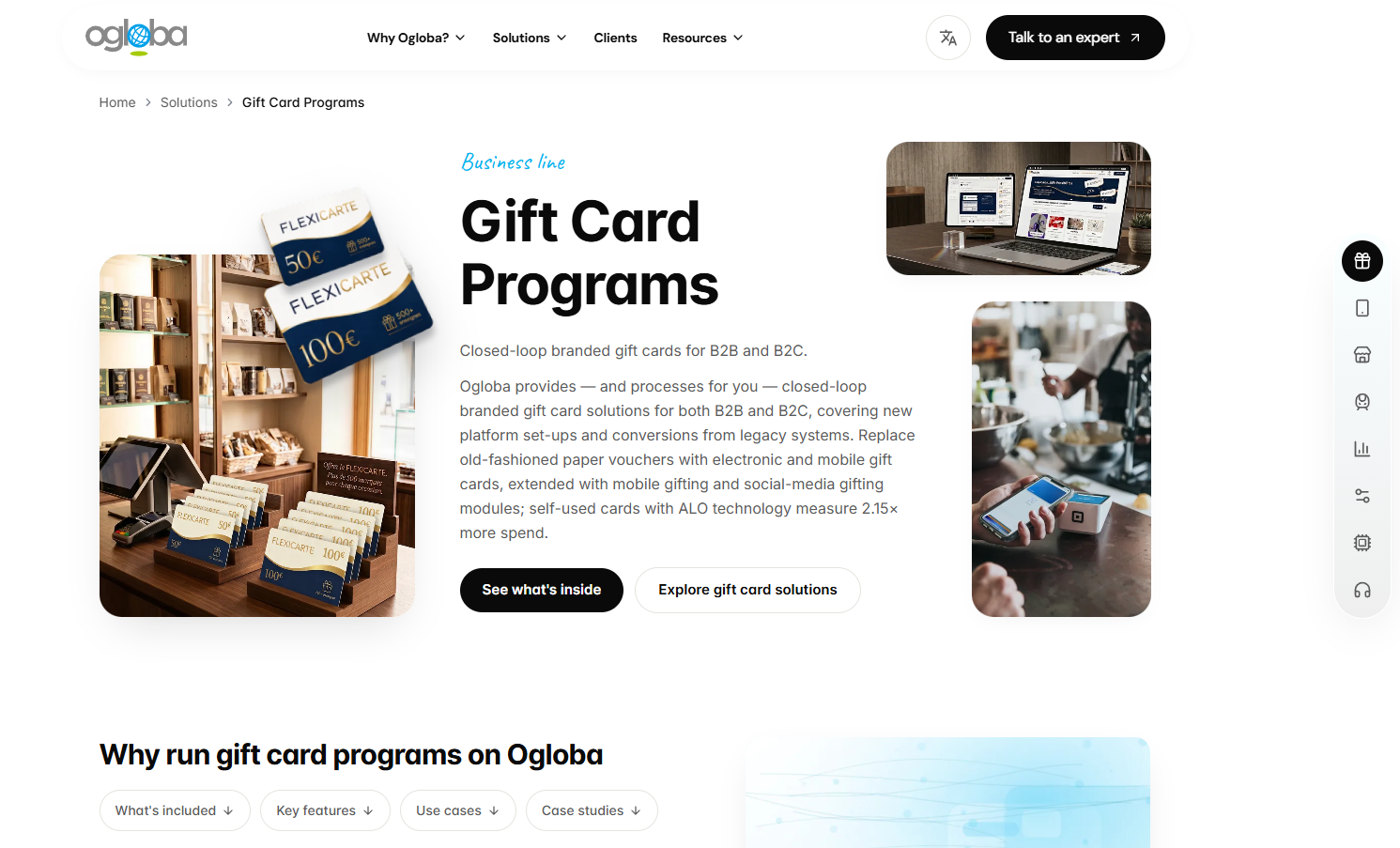
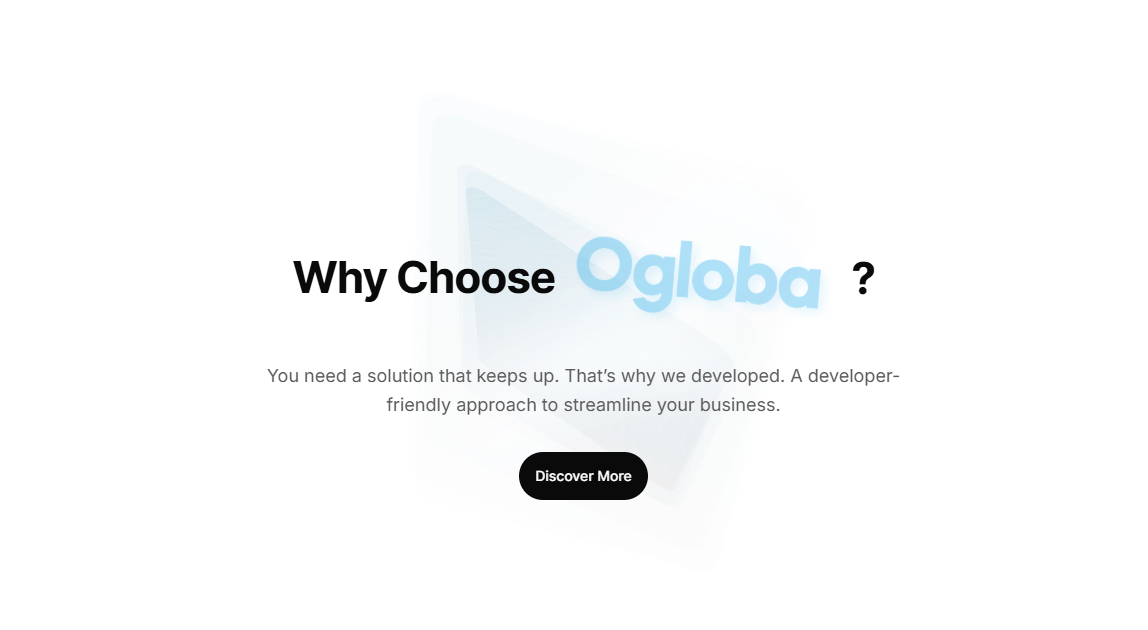
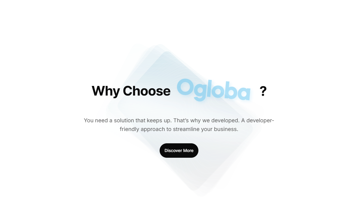
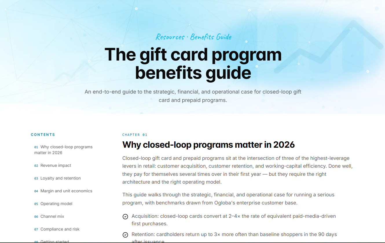
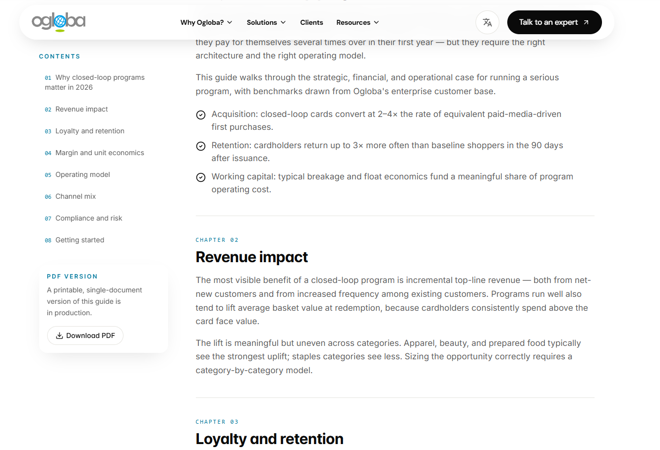
Illustrative composition, not exported private source. The two screenshots below show why one reusable section and one adaptable page template are more useful than a separate implementation for every screen.
Motion is an implementation decision
Replacing a video concept with a water ripple
My original circular dot concept relied on video. I changed the implementation to a WebGL ripple over a still image so movement could respond to the pointer without downloading that decorative video. The current helper limits active ripples, pauses its render loop outside the viewport and retains a static image when WebGL is unavailable or reduced motion is requested.
This exchanges video transfer and decoding for shader work on the device. It is not free performance. I need to check GPU cost, image loading and lower powered devices, and I have not published a measured loading improvement percentage.
Using an image to create depth
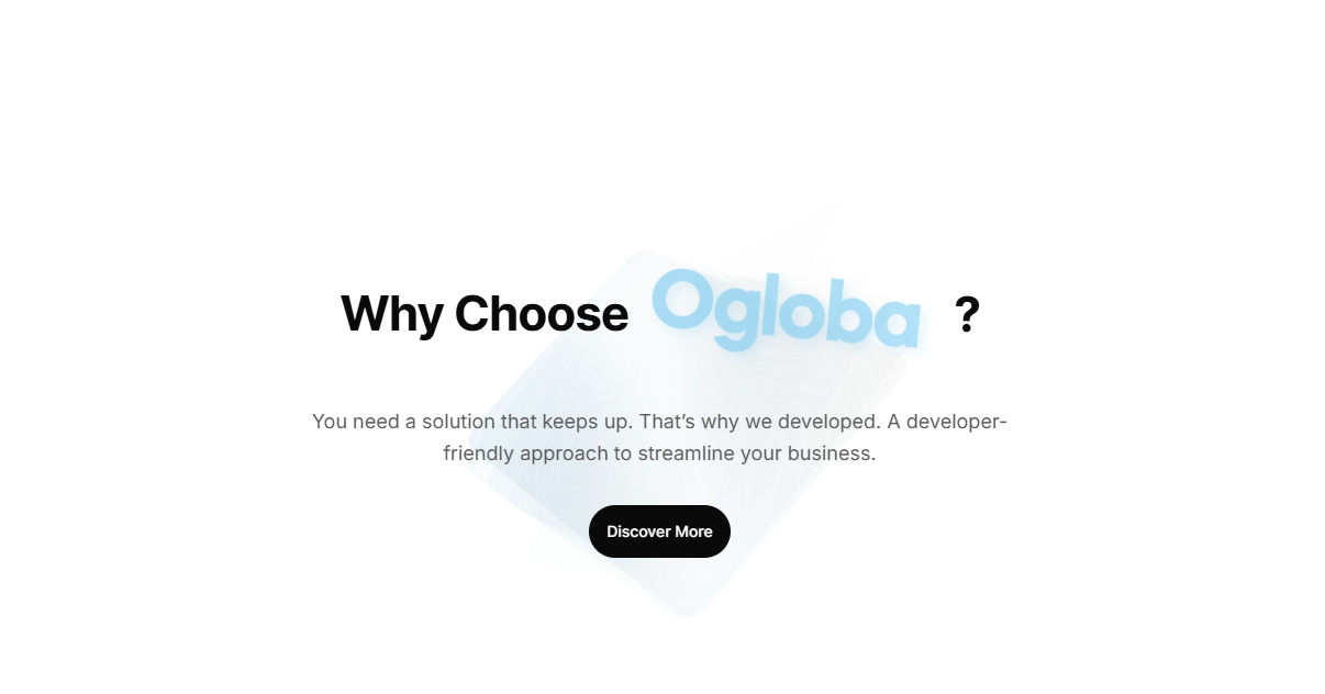
In WhyChoose, the same prepared card image is reused in translucent layers. Rotation, perspective, opacity and staggered timing create the dimensional effect in code. I can tune the movement without rendering a new video, while the heading and action stay still. Under reduced motion, the extra trails and continuous rotation are removed.
Keeping the custom cursor optional
The CTA follower is attached to marked actions, not every pixel of the page. It is enabled only for a fine pointer without a reduced motion preference. The native cursor is hidden only while its replacement is available. On touch devices, the same action remains an ordinary usable link. The decoration never carries the only instruction.

Language changes the layout contract
The implemented prototype has English, French, Spanish, Traditional Chinese and Simplified Chinese. I keep messages separate from components and review line wrapping, text density, navigation width and button labels with actual strings. A layout that works only with short English copy is not a reusable layout. Arabic and RTL are future scope for this project, not completed work shown here.
SEO decisions I built into the structure
I treat search presentation as part of the information architecture. A visually finished page is not enough if its locale, identity or publication state is unclear to a crawler or to someone opening a shared link.
One route identity per language
A shared metadata builder combines the locale and page path to create a self referencing canonical and matching hreflang alternatives, including an English x-default. This avoids maintaining a separate language-link list inside every page. The production origin is configurable, so deployment still needs an explicit hostname and indexing review.
Sharing metadata follows the same page
Titles, descriptions and social URLs come from the same page contract. Open Graph locale identifiers are mapped separately, such as en_US and zh_TW, rather than assuming a route code is the correct social locale format. A share card should describe the page the reader will actually reach.
Structure that survives the animation
The visual hero cycles through words, but a stable semantic headline remains available. Resource pages have real chapter headings and breadcrumb data. The metadata helper generates BreadcrumbList structured data from the same named route hierarchy instead of relying on a decorative breadcrumb image.
Publication readiness controls discovery
Draft legal pages are noindexed and excluded from the sitemap while awaiting review. Sitemap generation expands the supported locale set and uses an explicit content date rather than pretending every request is a fresh update. These are publishing decisions, not promises of higher rankings. Robots rules and noindex are not access control for confidential material.
The repository has unit checks for canonical paths, language alternatives, breadcrumb positions and sitemap behavior. I still review rendered metadata and the final deployment origin. A passing test cannot decide whether a draft is appropriate to publish.
Accessibility changed the interaction design
I want the personality of the interface to remain available without making motion, a mouse or perfect vision a requirement. These are concrete implementation choices in the prototype, not a claim of complete accessibility certification.
Give the carousel back to the reader
The product carousel has previous, next and pause controls, keyboard arrow handling and slide names. Rotation pauses on hover or focus and stops when the user pauses it or requests reduced motion. Automatic movement must not compete with reading.
Do not announce every automatic slide
A live region that reads a new slide every few seconds would interrupt a screen reader user. The prototype keeps it off during automatic rotation and makes it polite when rotation is stopped by the user or reduced motion.
Separate decorative motion from meaning
The rotating headline uses a stable accessible sentence while the changing visual words are hidden from assistive technology. Cursor art and background layers are decorative. They must not produce duplicate names or become focus targets.
Use fallbacks as part of the design
A static ripple image, a still depth treatment and ordinary links on touch are intended alternatives, not broken versions. I also review focus visibility, contrast, 44 pixel controls, image alternatives and text reflow at narrow widths. Browser checks still need to cover these details on the actual device and content.
A simplified enhancement gate captures the idea. The action remains available regardless of whether this optional effect is enabled.
const finePointer = window.matchMedia('(pointer: fine)')
const reducedMotion = window.matchMedia('(prefers-reduced-motion: reduce)')

const enableCursorEffect = finePointer.matches && !reducedMotion.matches
// Keep the native link, keyboard focus and accessible name in every mode.
UI review runs alongside implementation
I compare each section with the completed design, test real content, move through intermediate viewport widths and revisit any shared rule that caused a repeated defect. I separate UI review, such as hierarchy, focus and responsive wrapping, from functional testing of data, permissions and business rules. A beautiful prototype does not prove backend behavior.
The desktop and mobile captures are evidence of the interface at a particular moment. They are not a substitute for keyboard tests, device testing or a performance trace. This article also keeps the main reading path selective and loads the complete screenshot gallery only when requested.
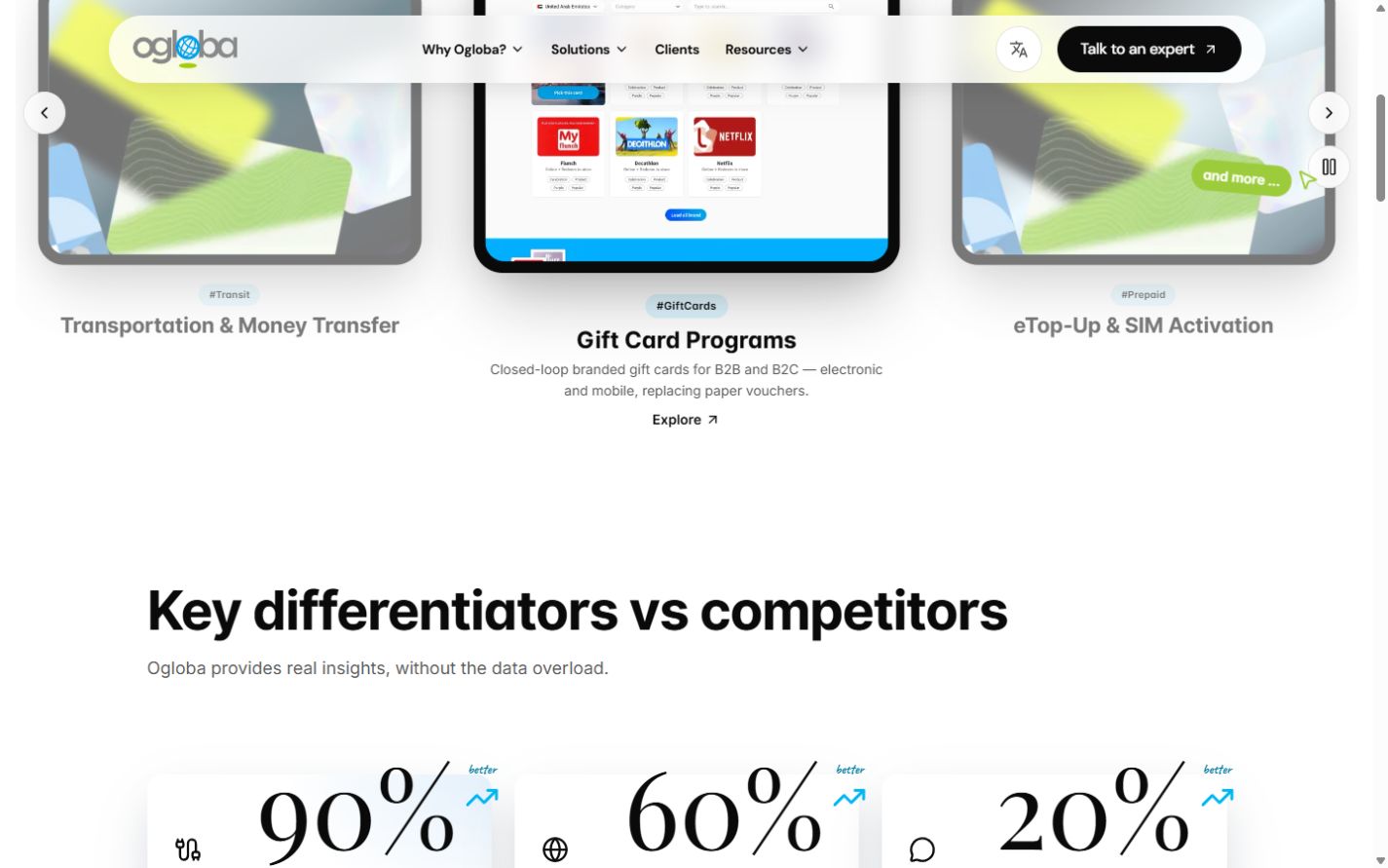
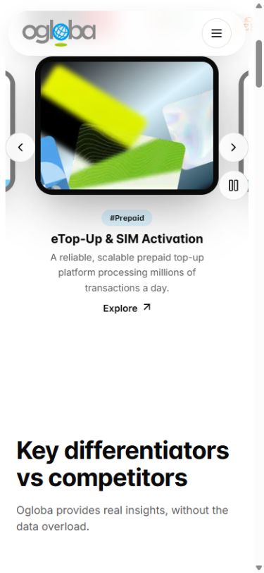
Two routes from validated design to production
Continue in React
I review which components should be retained or rebuilt, align with engineers on real data and business logic, and repeat accessibility, performance and regression checks. The prototype carries tested design intent into implementation. It does not bypass engineering review.
Return to Figma for WordPress
When WordPress is the destination, I bring the validated structure back into Figma and apply the project's Elementor naming and section rules. Those names are a handoff convention, not a universal automatic conversion format. After Elementor implementation, I check UI and responsive behavior again because its layout and breakpoint behavior can differ from React.
The live link in this article demonstrates the Next.js prototype. It does not demonstrate a completed WordPress migration or a final production launch.
What AI accelerated and what I owned
AI helped with scaffolding, repeated markup, implementation alternatives and code iteration. I owned the sitemap, completed design, workflow rules, visual judgment, motion direction, responsive decisions and the acceptance criteria. Reviewing weak output and deciding what should not ship are part of that work.
The result I can show is an operable, component based prototype and a reusable delivery process. To claim a business or efficiency gain, I would first record comparable review time, revision rounds, escaped defects, media weight and the amount of code reused in production. I would rather show the decisions and artifacts than invent a percentage.
More implementation evidence
These 23 screenshots preserve the broader work, including navigation, product templates, resources, contact, timeline and motion states. Open a figure for the full size image. The gallery is optional so it does not interrupt the article's main reading path.